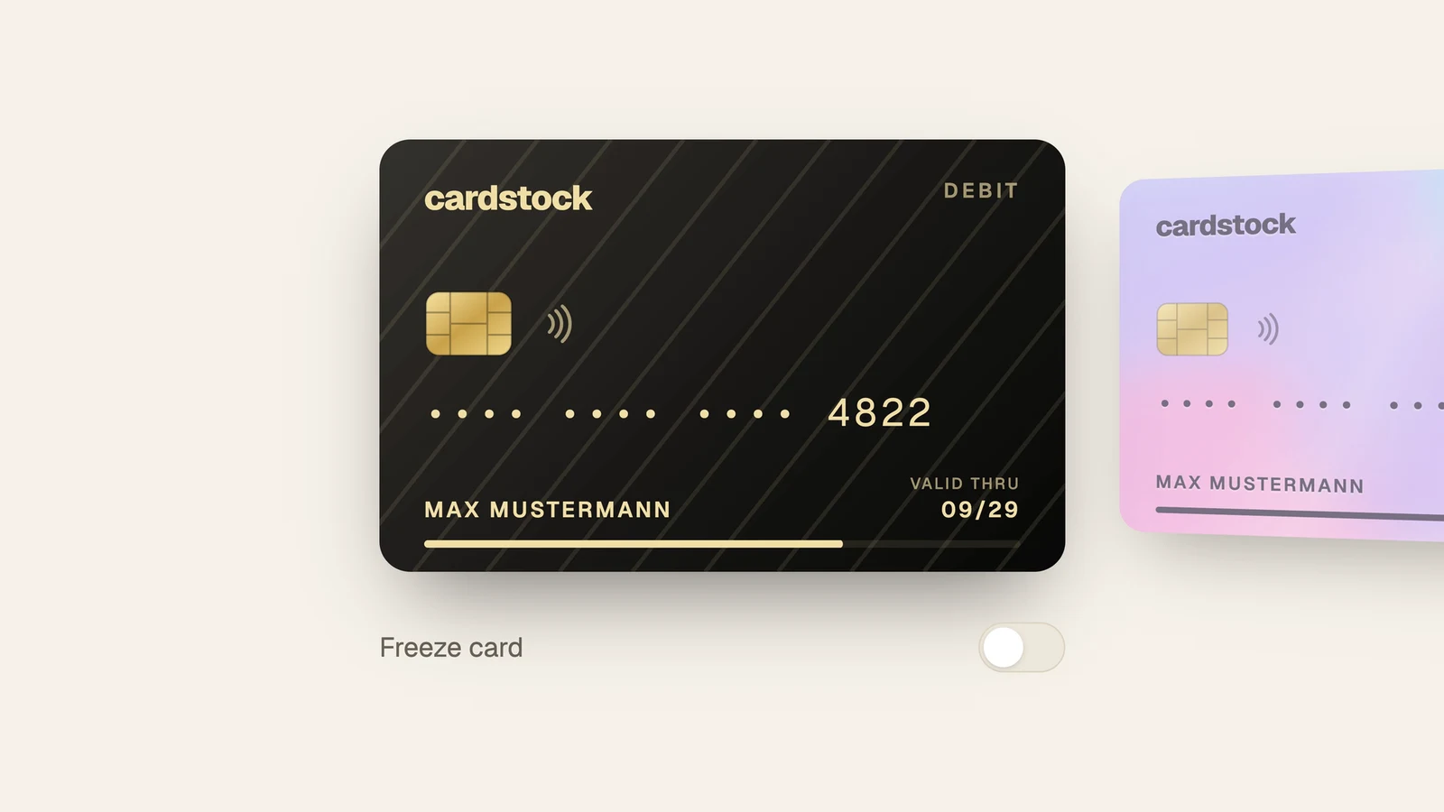
<Card.Root background={BACKGROUNDS.holo}>
  <Card.Tilt>
    <Card.Body>
      <Card.Front>
        <Card.Background />
        <Card.Number value="4821 5903 2716 4822" />
        <Frost />
      </Card.Front>
      <Card.Back>
        <Card.SecurityCode value="731" />
      </Card.Back>
    </Card.Body>
  </Card.Tilt>
  <Card.FlipTrigger aria-label="Turn the card over" />
  <Card.RevealTrigger>Show details</Card.RevealTrigger>
</Card.Root>
How it's built
Parts that report state, styling that stays yours
Each part renders one plain element and writes what it's doing as data-* attributes and CSS variables: data-flipped, --card-tilt-x, --card-spending-ratio, each digit's data-char-state while it decodes. The flip, the tilt and the glare are a few lines of CSS on those. The design follows Base UI: every part takes a render prop, so a part can become a Motion element, and the flip turns on a spring instead of a transition. Tailwind, plain CSS or no animation at all work the same way.
The number decodes, the card freezes
"Show details" doesn't swap the text. Each masked digit cycles through random ones and settles, one after another, in a fixed-width cell, so nothing on the card moves. Reveal groups hide the number again on a timeout, and a copy trigger only works while the number shows.
Freezing takes a snapshot of the card's face and runs it through a small WebGL2 shader that spreads frost in from the edges and refracts what's underneath. It holds no GPU context until the first freeze or an idle moment after load, gives the context back when the card leaves, and falls back to a plain frosted gradient where WebGL2 isn't there.
Backgrounds are data
A card's background is a small JSON value: a colour, a gradient or an image with its dominant colour, validated so it can come from a database. The same value paints the face, decides whether the text reads light or dark, fills in while an image loads, and is what the frost draws under the face. The library comes with ten pieces of original artwork, like guilloché, holo and topographic lines, and four gradients.
A carousel that feels like a banking app
The track follows the pointer. On release it snaps on a spring that keeps the speed of the flick and rubber-bands past the ends. The carousel only writes each slide's offset as CSS variables, so the coverflow in the demo, with the side cards turned away and set back, is plain CSS.
Documented, and copyable
The docs site is a TanStack Start app with Fumadocs, prerendered and served from Cloudflare. Every demo is live, and the styled cards and carousel ship as a shadcn registry, so npx shadcn add copies them into a project to change freely. There are pages on anatomy, styling, animation and accessibility, plus plain-text llms.txt versions for coding assistants.
The launch video above is the real library too. A small recorder drives the docs' own components with a scripted mouse and a virtual clock, rendering every frame at 4K and 120 fps, so the video is exactly what the code does, with no dropped frames.
Docs and live demos · npm · GitHub